- Overview
- Data and Metrics
- Monthly Operational Expenses Dashboard
- Cost per Flight Dashboard
- Closing Reflections
Overview
In this project, I analyzed the operational costs of a ficticious airline across multiple accounts and stations for Q4 2023. The project involved transforming accounting and flight data to compute and visualize cost per flight, identify high-impact expense categories, and track anomalies in monthly trends. Two dashboards were developed: one for monthly expense monitoring and another for flight cost analysis.
The goal was to help an airline’s finance and operations teams understand where and how operational costs were accumulating during the last quarter of 2023, and to assess efficiency by computing cost per flight across stations and accounts.
Data and Metrics
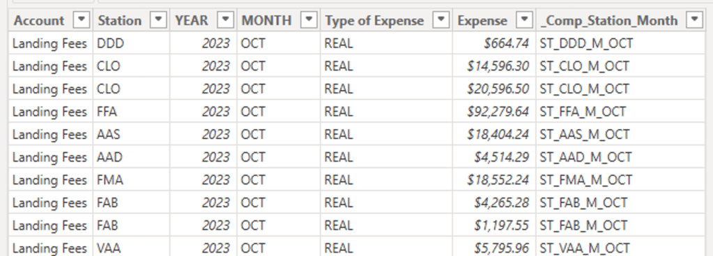
Expenses Table
Monthly accounting expenses records with the following relevant features:
- Month: Month in which expenses took place.
- Station: Airport/station code.
- Account: Type of expense (e.g., Landings Fees, Waiting Lounge).
- Type of Expense: REAL (realized) or EST (estimated).
- Amount: Expense amount.
- Comp_Station_Month: Calculated string feature used as a composite key, aggregating expenses by the Month and Station they ocurred in.
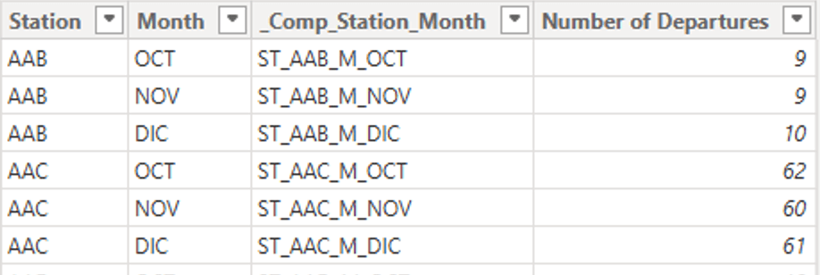
Departures Table
Number of takeoffs per month and station
- Month: Month in which departures took place
- Station: Airport/station in which departures took place.
- Number of Departures: Count of departures observed.
- Comp_Station_Month: Calculated string feature used as a composite key, aggregating departures by Month and Station they ocurred in.
Calendar Table
A table generated as best practice to maintain date format consistency and time intelligence features
Year and Month Reference Tables
A set of tables with unique references for years and months respectively. It is used to build a one-to-many relationship with both the calendar table and the expenses table
Calculated Metrics
Metrics used to research cost analysis.
- Total Expenses: Sum of expense amounts
Total Expenses = SUM(Expenses[Expense])
- Total Departures: Sum of flight departures registered
Total Departures = (
    VAR n_flights = SUM(Departures[Number of Departures])
    RETURN IF(ISBLANK(n_flights), 0, n_flights)
)
- Average Monthly Expenses: Total expenses divided by the number of months respresented within them.
Average Monthly Expenses = (
    VAR average_expense = DIVIDE([Total Expenses], DISTINCTCOUNT(Expenses[MONTH]))
    RETURN IF(ISBLANK(average_expense), 0, average_expense)
)
- Cost per Flight: Total expenses divided by total departures associated to the corresponding station and month
Cost per Flight = (
    VAR cost_per_flight = DIVIDE(
            [Total Expenses],
            [Total Departures],
            "-")
    RETURN IF(ISBLANK(cost_per_flight), 0, cost_per_flight)
)
The following data model provides a detailed overview of how the data was used.

Monthly Operational Expenses Dashboard

This dashboard is composed of six main elements:
- The Dashboard Summary: A direct and brief introduction to the main insights derived from the dashboard. It highlights both takeways gathered at a glance, like the total expenses or account with the highest expense; and insights found after digging around and interacting with the filters.
- Filter Controls: A set of dropdown menus to filter accross multiple features individually or simultaneously.
- Total Expenses per Station Bar Chart: A horizontal bar chart detailing the total expenses for each station.
- Data Cards: The Data cards next to the Total Expenses bar chart aggregates the sum and monthly average of total expenses for a macro perspective of the data.
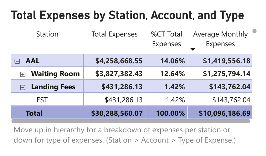
- Total Expenses Matrix: The total expenses matrix presents detailed numbers and percent distribution for expenses by station, account and/or type of expense oranized in a hierarchy.
- Monthly Expenses by Month and Account Stacked Bar Chart: This chart highlights the amount and distribution of expenses observed every month
Cost per Flight Dashboard
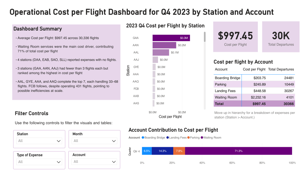
This dashboard takes advantage of similar design patterns to the monthly expenses dashboard so that the user can focus on insights and research instead of learning to operate mechanically unique dashboards. These are its main elements
- The Dashboard Summary: A direct and brief introduction to the main insights derived from the dashboard. Here i’ve focused on pointing out the stations with the most relevant cost to flights ratio, and what makes them interesting
- Filter Controls: A set of dropdown menus to filter accross multiple features individually or simultaneously. Identical to the one in the monthly expenses table.
- Cost per Flight by Station Bar Chart: A horizontal bar chart detailing the cost to number of flights ratio for each station.
- Data Cards: These data cards clearly highlight the Total cost per flight and total number of flights for the currently selected flights.
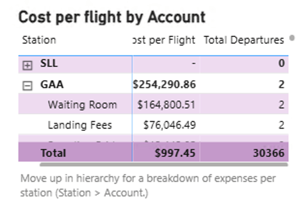
- Cost per Flight by Account Matrix: Presents detailed numbers and percent distribution for expenses by station, account and/or type of expense oranized in a hierarchy.
- Account Contribution of Cost Per Flight 100% Stacked Bar Chart: This chart highlights the percent of costs per flight contributed by each account so that the user can better understand where are costs and inefficiencies comming from
Closing Reflections
Although I’ve been tinkering with dashboards for a while this is the first time i’ve shared one online. Having this goal in mind since the start of the project really pushed me to make the most out of the interface design of the dashboard, taking into account visual hierarchies and patterns of usage. Although i found myself being very comfortable loading and transforming the data –avoiding any kind of stumbles in thata regard, the highlight of this project for me was iterating and learning how to build towards a usable and insight-driven interface for my dashboards.

Leave a comment