Recently, while researching how tourism in Panama has evolved since the global pandemic of 2020, I came across official reports analyzing the performance of tourism in Panama during 2024. One of these documents included a statistical summary presented to go over key metrics. While examining this report, I noticed some graphs that felt cluttered and underdeveloped, and it ocurred to me that it would be an interesting project to reimagine these graphs and share my process as I try to enhance its readability and effectiveness. That’s what i’ll be sharing on this post.
Table of Contents
- Identifying the Structure of the Original Graph
- Highlighting the Issues of the Original Graph
- Building a Solution that Adresses the Issues
- Closing Thoughts
Identifying the Structure of the Original Graph
I’ve prepared a simple adaptation of the original graph to maintain a consistent color scheme and language in this post but you can see the original here. The graph we’ll be working with can be roughly split into 5 elements:
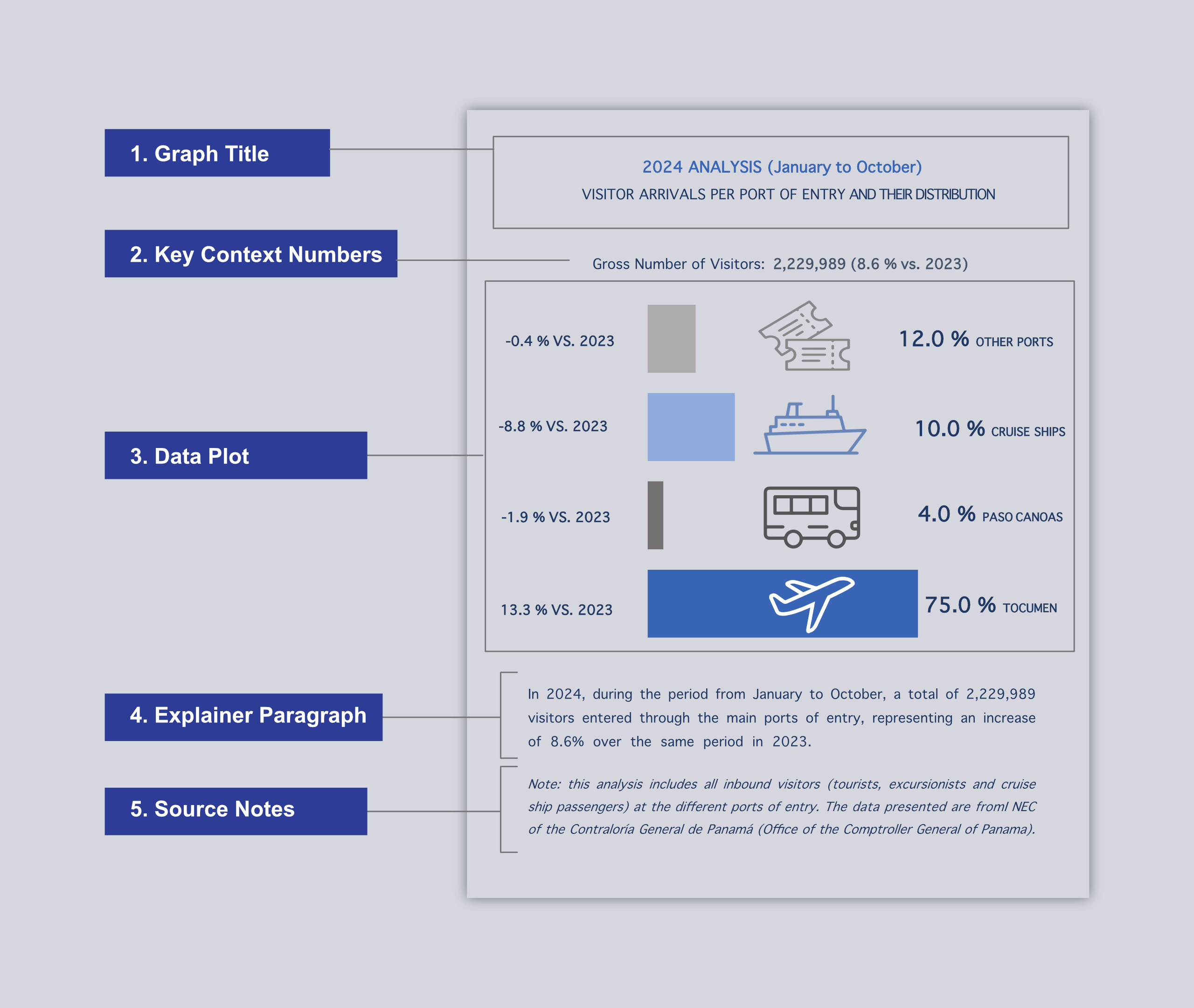
- The Graph Title: It presents the subject matter for the graph. In this case, Visitor Arrivals per Point of Entry and Their Distribution.
- Key Context Numbers: This line of text introduces the total number of international visitors observed during 2024 (2,229,989 Visitors) and the percentage difference relative to the number of visitors observed during 2023 (8.6%)
- Data Plot: The data plot of the graph is organized in four rows that correspond to the relevant points of entry for international visitors and displays data over three columns: the first column lists the percentage difference relative to the number of visitors observed during 2024 vs. 2023 in each point of entry, the second column shows a horizontal bar that serves as a visual reference for the proportion of visitors arriving through each point of entry and a simple vector graphic to illustrate what the diferent points of entry are associated with, and the third columns shows labels for both the proportion presented with the bar plot and the name of the point of entry relevant to each row.
- Explainer Paragraph: Short paragraph that goes over the data presented in the Key Context Number element in a verbose manner.
- Source Notes: Provides further context as to what qualifies as an international visitor and it references the data source for this graph.
Now that we know what makes up our graph lets take a look at what can be improved
Highlighting the Issues of the Original Graph
Issue #1 – Lack of clear visual hierarchy
Most of the cultures of the western hemisphere and some of the eastern hemisphere have the ingrained habit of reading from left to right and top to bottom. With that in mind, the content of an effective graph intended for these audiences will be arranged so that the reader has all the relevant context as they read and ideally never has to backtrack or skip ahead to understand its content. The ways in which this graph disregards visual hierarchy range all the way from minor, like not aligning the Graph Title and Key Context Numbers to the left; to mild, as in not having the same two elements be obvious enough (say bolder letters, larger font size) that it wont be dismissed in favor of the data plot; to major, where the name of the point of entry for visitor arrivals is positioned after all the data points related to it instead of before, meaning readers have to skip ahead or backtrack to make sense of it.
Issue #2 – Overloaded data plot
The original data plot tries to present too much information at once, making it difficult to read intuitively. It resembles a table more than a graph, which is not ideal for visual communication. What is specially jarring to me is the first “column” that provides interesting data in the percent difference of arrivals vs. 2023 in each point of entry but it only exists as numbers in labels beacuse it has no corresponding visual component to provide a sense of scale. In addition to that, the small vector illustrations provide a small amount of context but they are not necesary to understand the data and we would be better off without them.
Issue #3 – Redundant explainer paragraph
The Explainer Paragraph repeats what is presented in the Key Context Numbers, but avoids providing any further context on the Data Plot which is where it might be needed the most. Specially in a report presented as a statistical summary a explainer paragraph should be used to help a reader understand what can be learned from our plot.
Building a Solution that Adresses the Issues
Issue #1 focuses on the visual hierarchy of the elements in the graph. Among other issues it highlights how the Graph Title and Key Context Numbers are presented in contradiction with human intuition. The following adjustments were made to counteract this.
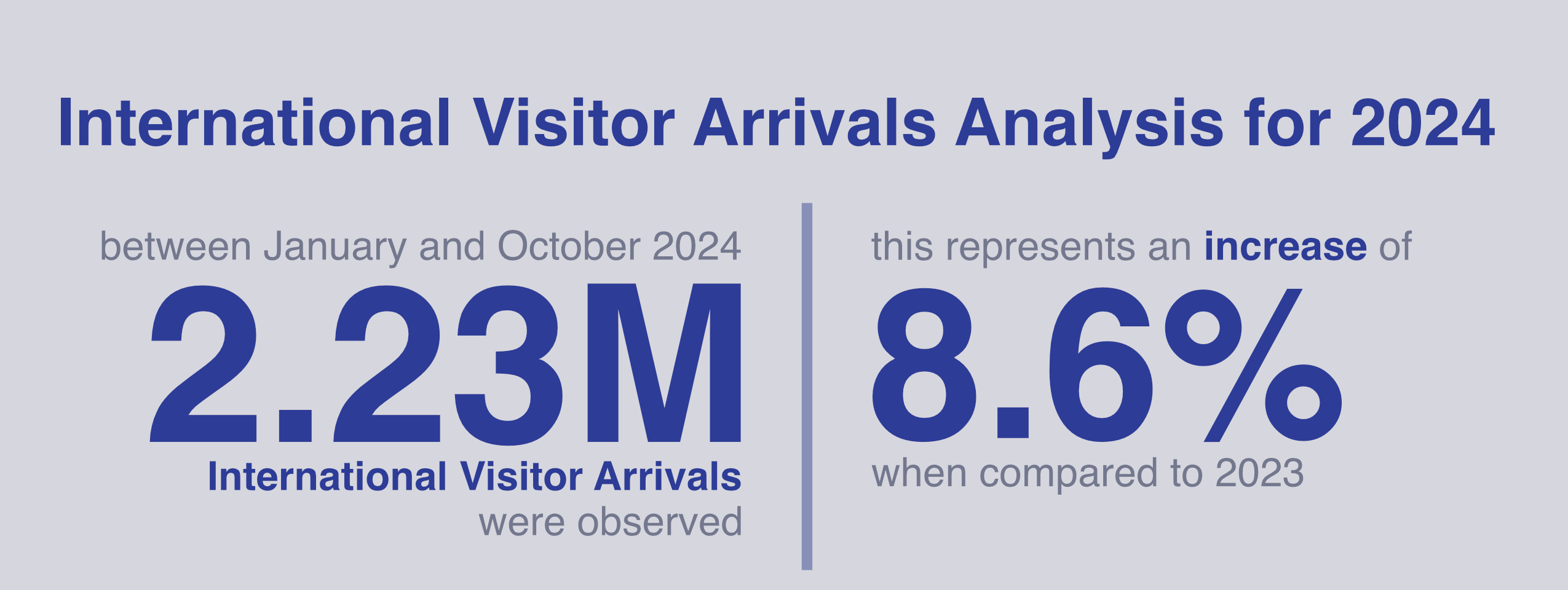
- The Graph Title was changed for a simpler title with larger bolder letters and its closer to the left margin.
- Key Context Numbers were made larger to the the point they are impossible to miss. A brief description guides the reader and avoids the need to add an explainer paragragh about it later on.
Issue #1 also introduces the lack of visual hierarchy in the Data Plot and issue #2 further highlights the idea that the Data Plot is trying to do too much and feels cluttered. Issue # 3 highlights the failure to implemente useful explainer paragrahs as the existing one is redundant. These were the actions taken:
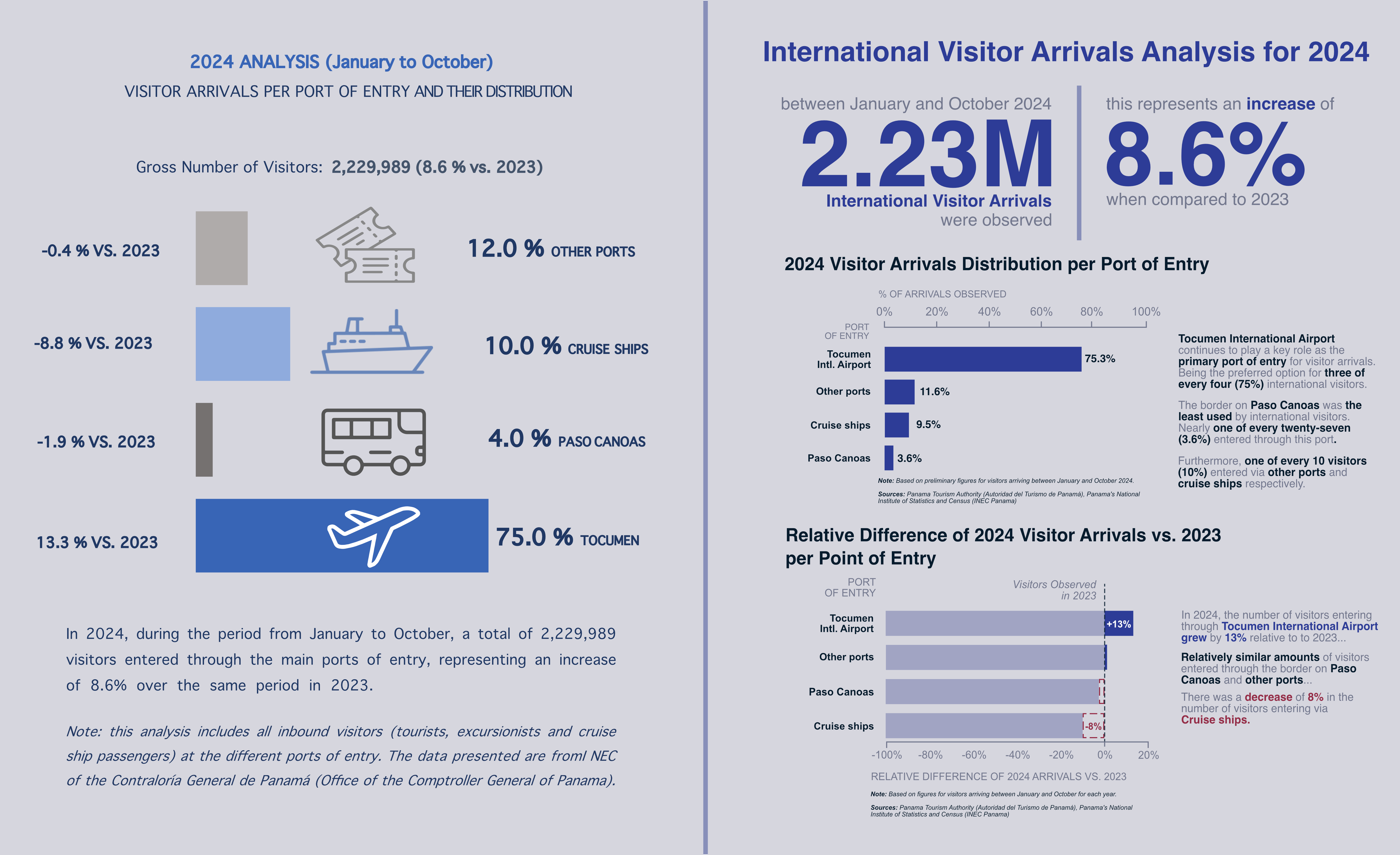
- The Data Plot was split into to individual plots each with its title, explainer paragraphs, and source notes. The first one showcases the distribution of visitor arrivals per port of entry and the second one how have arrivals changed since 2023 per port of entry.
- All port of entry labels are vertically aligned.
- An element of visual scale (bar chart) was added to visually convey how much is the relative difference when comparing ports of entry over time.
- Richer Explainer Paragraphs help the reader make full sense of the plot wich make sense for a statistical summary like this one. Bold text higlights the key takeaways.
- Vector ilustrations were removed in order to avoid distracting the reader.
- A limited color pallete was used to convey the difference between (likely) favorable and unfavorable measurements. It also helps the reader associate visuals with sections of the explainer paragraph.
- All plot axes were appropieately labeled.
- Adjusted decimal precision for distribution labels in order to avoid having redundant trailing zeros.

With these refinements, the revised graph is now clearer and more effective. Below is a side-by-side comparison of the original and improved versions:
Closing Thoughts
I undertook this project because tourism is frequently cited as one of Panama’s economic sectors with the most potential for growth. However, informed policy decisions require clear and intuitive data representation. Ineffective graphs can hinder progress toward economic development goals by making key trends harder to interpret.
Most of the principles guiding my judgement for this reimagining of a graph are based on Storytelling with Data by Cole Nussbaumer Knaflic (2015). If you’re interested in creating impactful visualizations, I highly recommend exploring this resource. The plots themselves where made first on a Tableau using the data cited in the source notes and then customized in Affinity Designer.

Leave a comment